b polonsky artworks
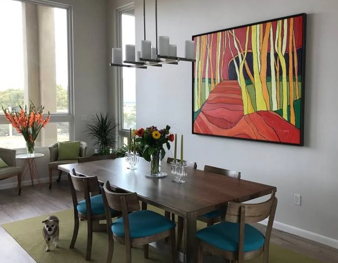
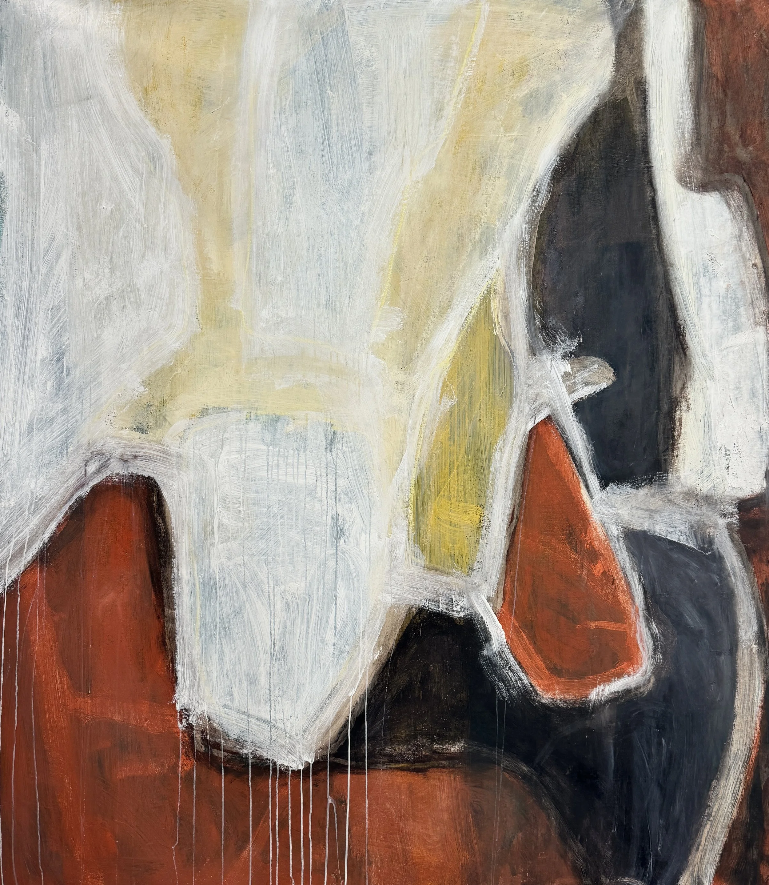
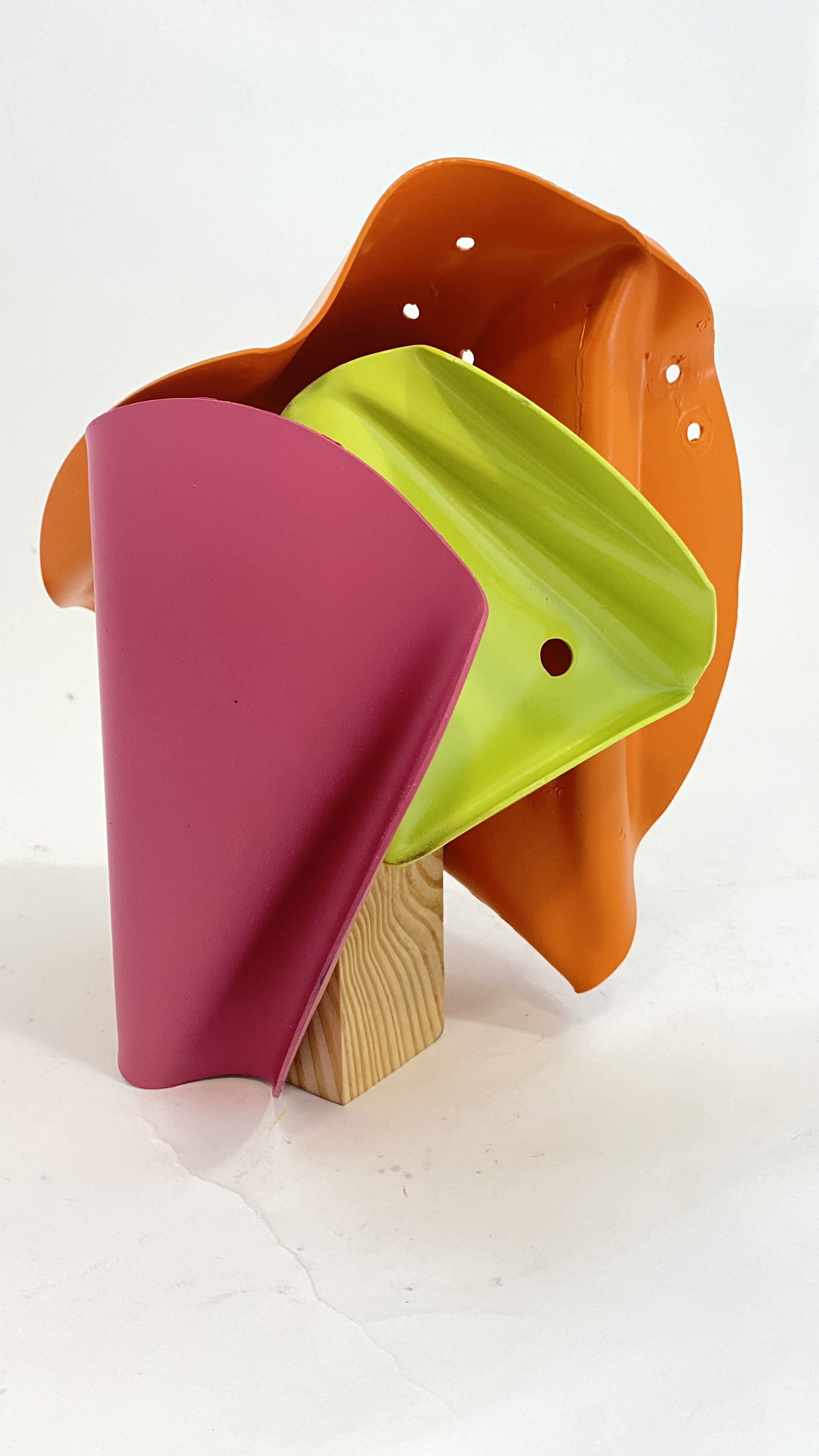
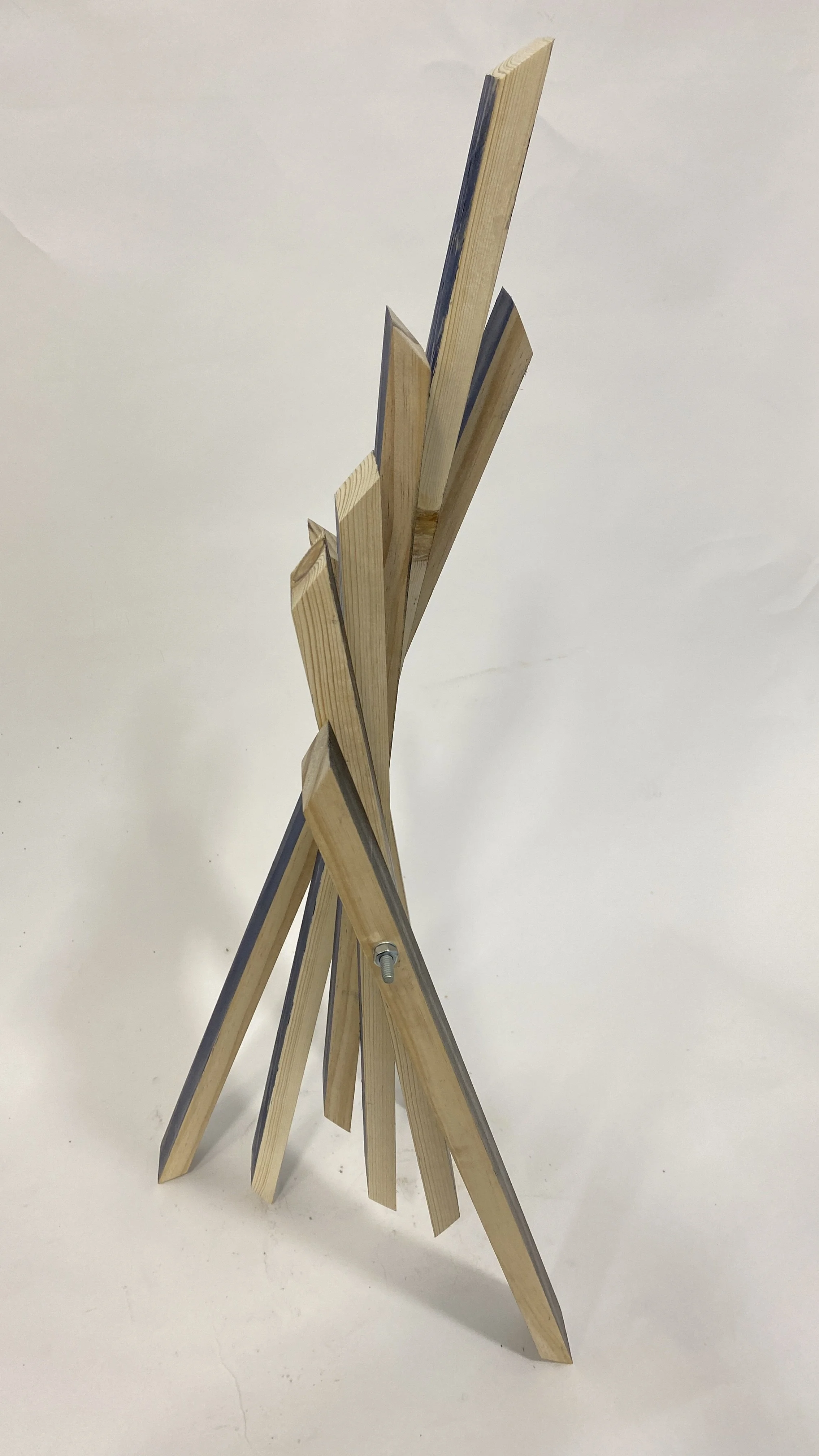
paintingS & sculptures by Brett Polonsky


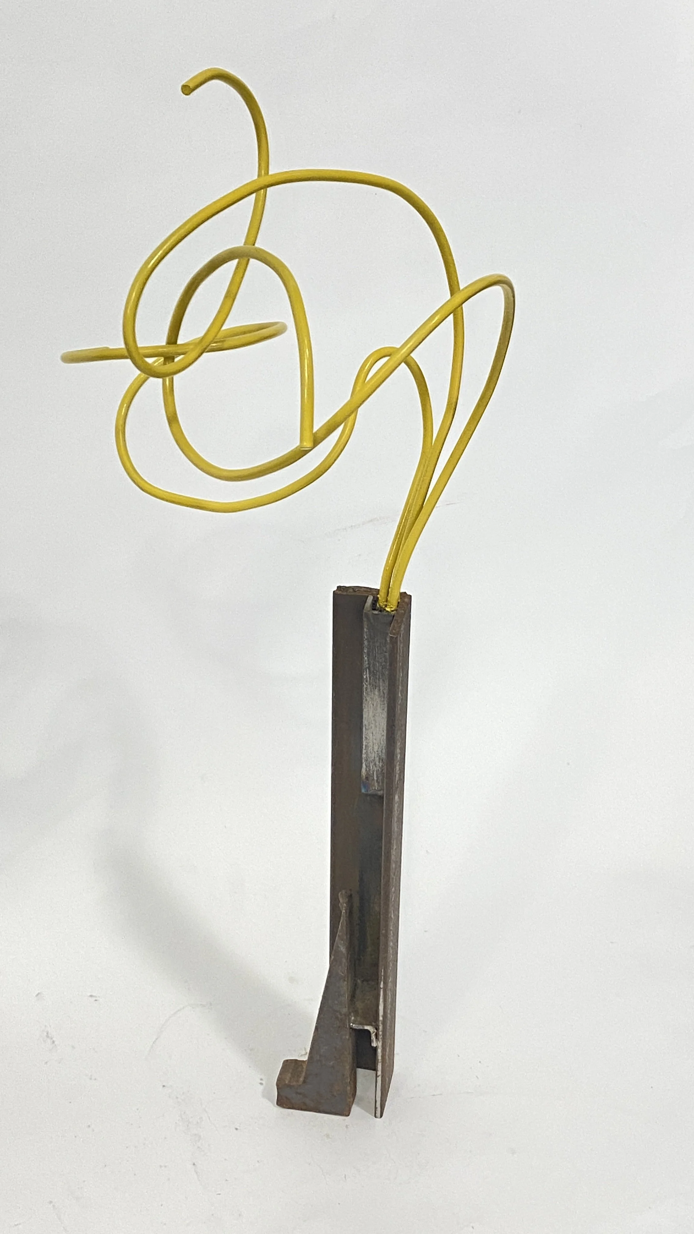
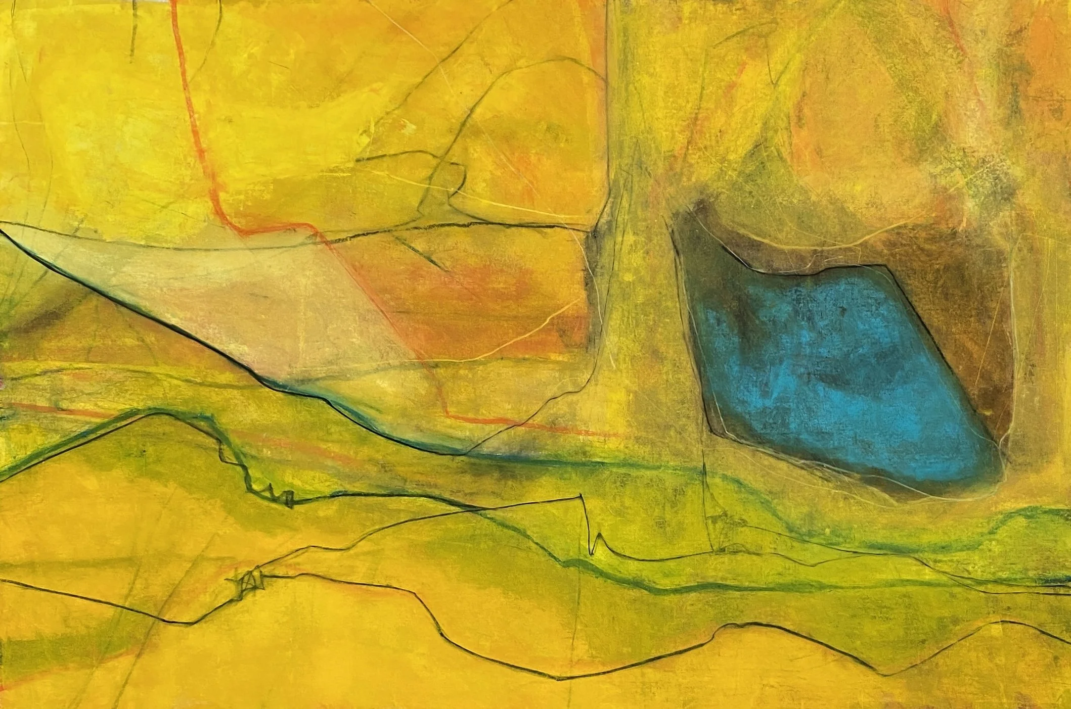


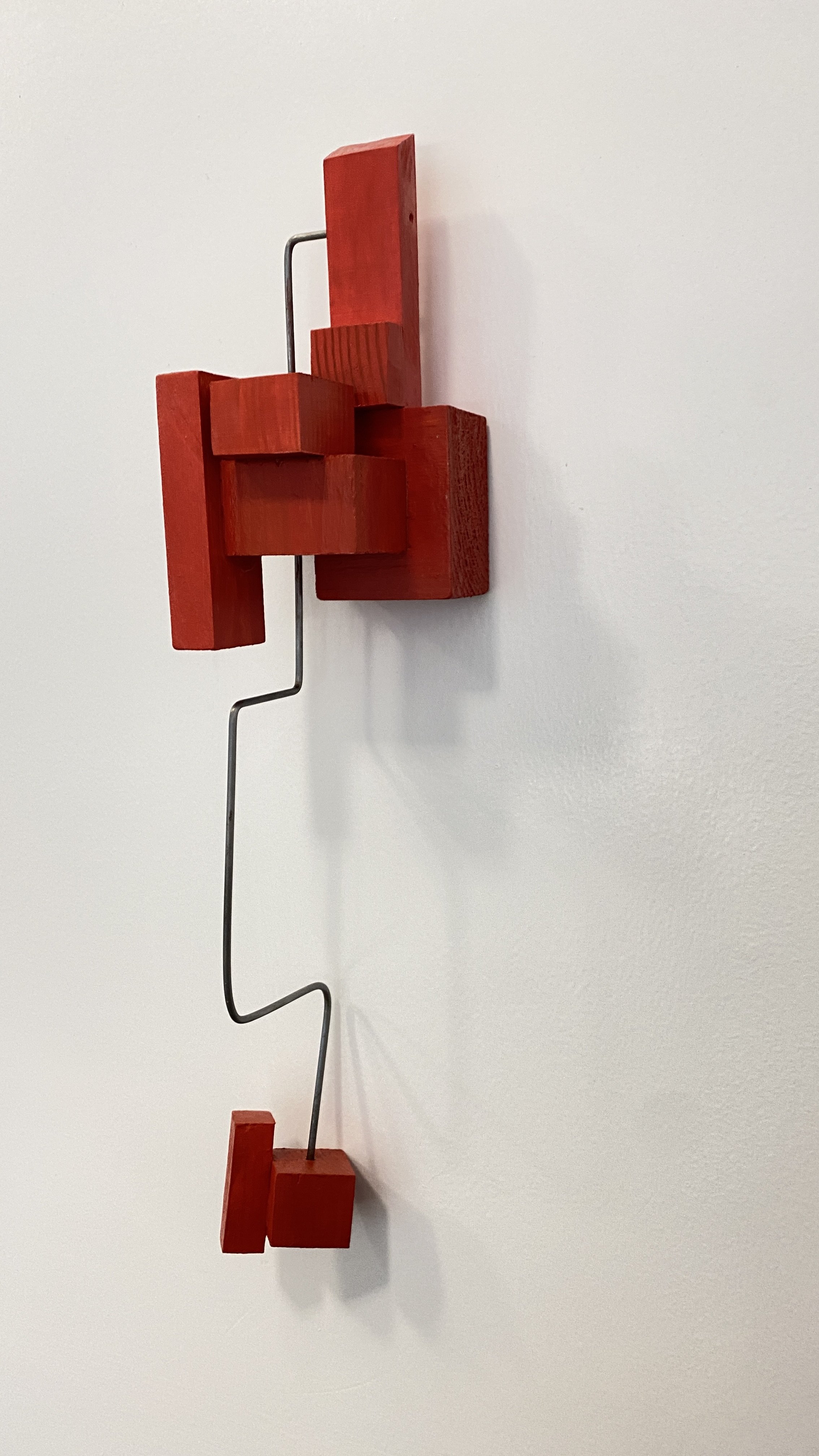
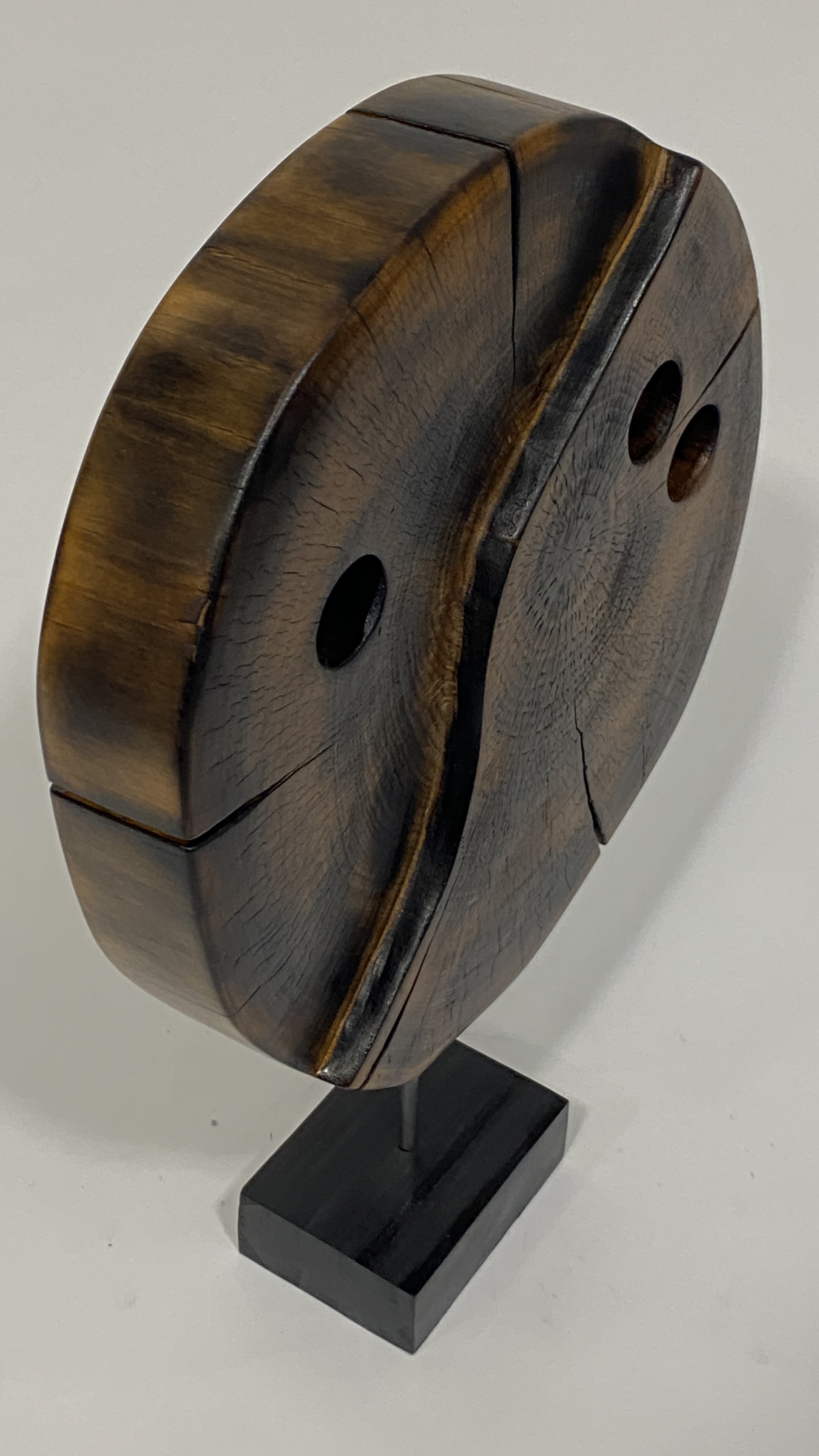


always creating
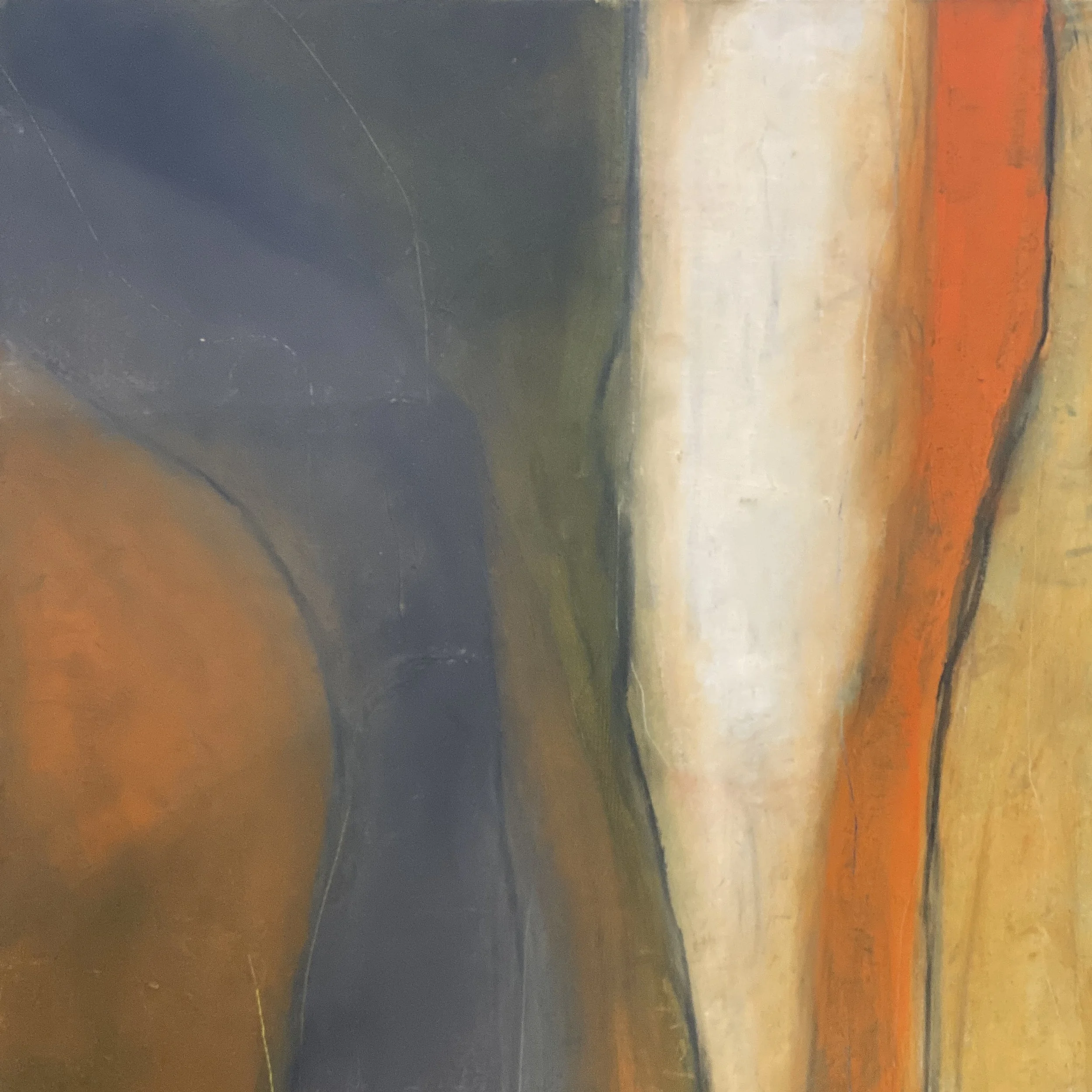
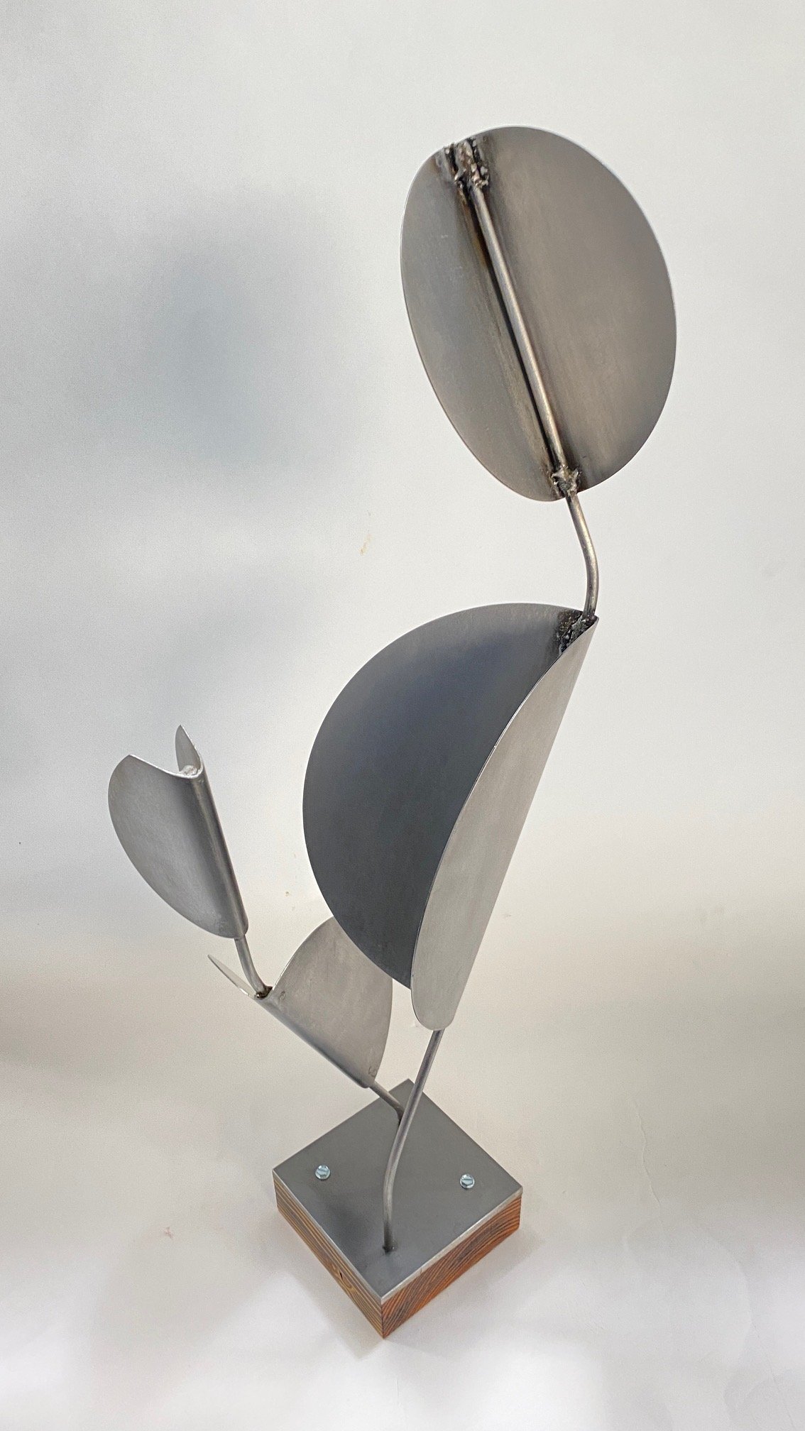
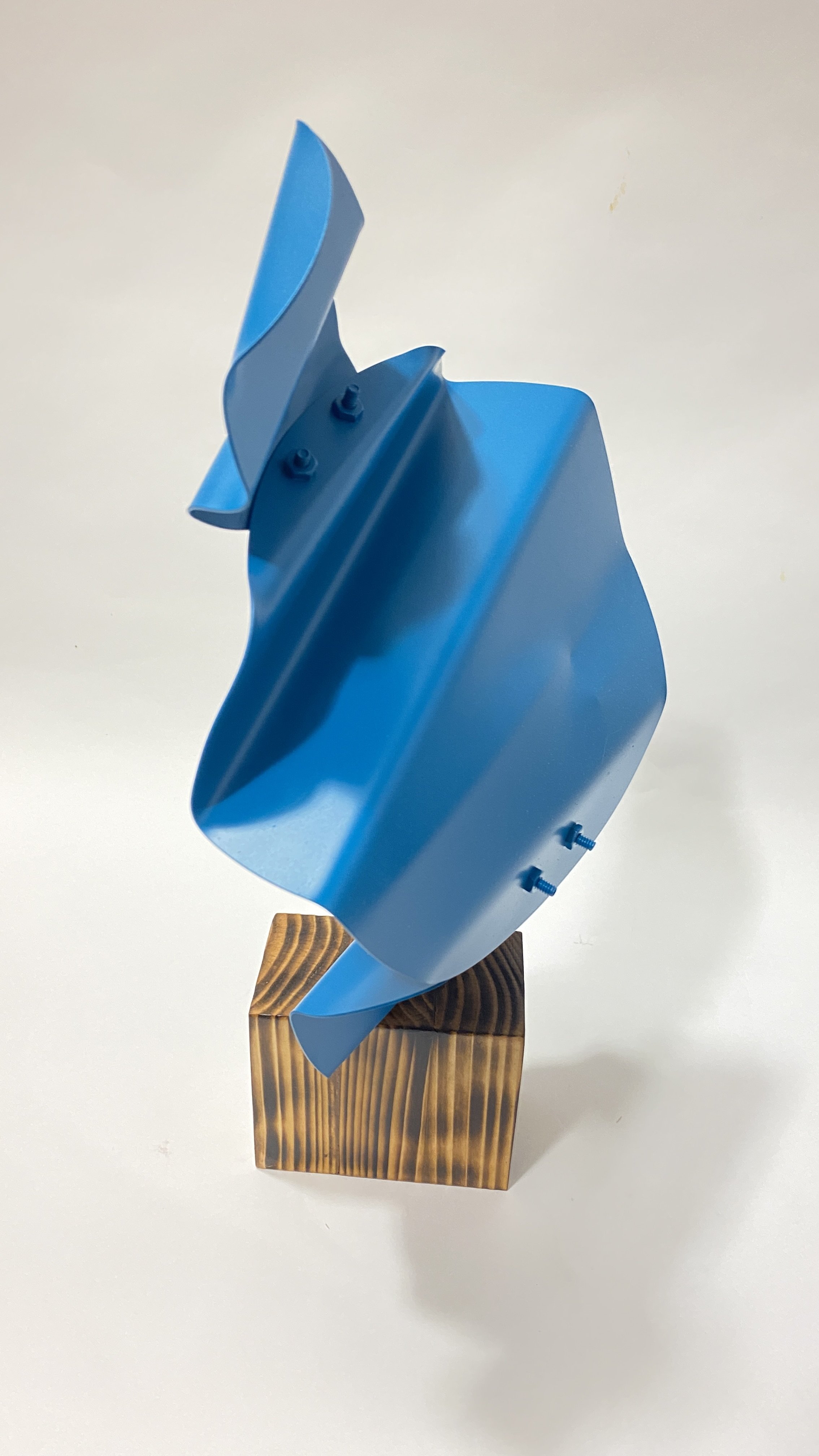
It’s a passion. It’s unavoidable. It’s who I am and who I’ve always been. Im always exploring new mediums and new ways to be creative visually. My work is often spontaneous and gestural…it happens in the moment.
Occasionally Ill have a plan, a color palette, or a small sketch I made waking up at 3am, but as I create the piece evolves, it’s a game we play together as the work starts to become what it was always meant to be.
I don’t aim for perfection, but I do aim to put everything I have into each unique piece, and i’m always thrilled when someone connects with my work and wants to make it part of their collection.
I hope you find something here that just feels right. Please contact me directly with any questions, thoughts, ideas or commissions!
Thank you!